
7 Essential Web Design Tips for Better Wix Sites
- Ekaterina WebcityX

- Feb 19
- 10 min read
Building a professional website on Wix sounds easy until you realize your site needs to work perfectly on phones, tablets, and computers. A page that looks stunning on a desktop can quickly turn clunky or unreadable on a smaller screen. Making sure every visitor has a smooth experience—no matter their device—takes careful planning and smart design decisions.
The right strategies can transform your Wix site from simply good-looking to truly user-friendly and accessible. You will learn simple and effective steps that tackle image loading, navigation, readable fonts, and more. Get ready to discover practical tips that will help your site shine and keep visitors coming back.
Table of Contents
Quick Summary
Takeaway | Explanation |
1. Use Responsive Design | Ensure your website adapts seamlessly across all devices for a professional appearance. |
2. Optimize Images for Speed | Compress and resize images to improve loading times and user experience. |
3. Choose Readable Fonts | Select clear, sans-serif fonts to enhance readability across different devices. |
4. Simplify Navigation Menus | Limit menu items and use descriptive labels for easier user access to content. |
5. Regularly Test and Update | Conduct regular audits and updates to maintain website performance and relevance. |
1. Use Responsive Design for All Devices
Responsive design is the secret weapon for creating websites that look amazing on every device. By implementing responsive web design principles, you can ensure your Wix site adapts seamlessly across smartphones, tablets, laptops, and desktop computers.
Why does responsive design matter? Modern internet users switch between multiple devices constantly. Your website needs to look professional and function smoothly whether someone is browsing on a tiny smartphone screen or a large desktop monitor.
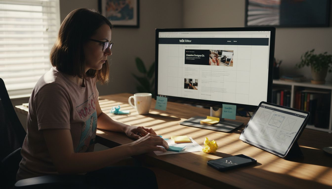
Keep in mind that the classic Wix Editor is not fully responsive and does not include a dedicated iPad view. Text and images do not scale proportionally across all screen sizes, which makes it difficult to achieve a truly responsive and polished result. Because of these limitations, it’s not possible to create a fully responsive, professional-looking website using the classic editor alone.
That’s why we build our clients’ websites with Wix Studio — an advanced, fully responsive platform that offers far greater design flexibility and control. With Wix Studio, there are virtually no layout limitations, ensuring your website looks flawless and performs perfectly on every device.
Key responsive design strategies include:
Fluid grid layouts that automatically resize
Flexible image and media scaling
CSS media queries to adjust design elements
Touch-friendly navigation for mobile screens
Consistent user experience across all devices
Responsive design transforms your website from a static page into a dynamic experience that meets users wherever they are.
Implementing responsive design on Wix Studio involves using their built-in responsive design tools. Start by selecting mobile-friendly Wix Studio templates, then customize your layout using Wix’s responsive editing features. Test your site on multiple devices to ensure smooth performance.
Pro tip: Always preview your Wix site on different screen sizes during development to catch and fix potential layout issues before launching.
2. Optimize Images for Fast Loading
Large unoptimized images can kill your website’s performance faster than you might think. Image optimization techniques are crucial for creating a smooth user experience that keeps visitors engaged and reduces bounce rates.
Why do image sizes matter? Massive image files slow down page loading times significantly. Slow websites frustrate users and can negatively impact your search engine rankings. Modern web design demands efficiency and speed.
Key image optimization strategies include:
Resize images to match display dimensions
Compress images without losing visual quality
Use next-generation image formats like WebP
Implement lazy loading for image-heavy pages
Choose appropriate file types (JPEG for photos, SVG for graphics)
Optimized images are the silent heroes of fast web performance.
When working with Wix, you can leverage their built-in image optimization tools. Always upload high-quality source images and let Wix automatically compress and resize them for different device screens. The platform helps you maintain image quality while ensuring rapid loading times.
Pro tip: Use free online tools like Squoosh to pre-optimize your images before uploading to Wix, ensuring maximum performance and minimal file size.
3. Choose Clear, Readable Fonts
Your website’s fonts are more than just letters on a screen. Web typography directly impacts user experience and can make or break your site’s professional appearance.
Font selection goes beyond aesthetic preferences. The right typography improves readability reduces eye strain and helps visitors understand your content more effectively. Different screen sizes and resolutions require careful font choices to maintain clarity across all devices.
Key font selection strategies include:
Prioritize sans-serif fonts for digital screens
Maintain consistent font sizes and weights
Ensure sufficient contrast between text and background
Use no more than 2-3 font variations per site
Set appropriate line height and letter spacing
Typography is the art of making words readable and beautiful.
When working with Wix choose fonts that are clean professional and easy to read. Most modern sans-serif fonts like Open Sans Roboto or Montserrat work well across different devices and languages. Avoid decorative or overly complex fonts that might look interesting but compromise readability. Use default Wix fonts whenever possible, and limit 2 or maximum 3 types of fonts for your site.
You can upload your own fonts to Wix if you don’t find them in the built-in font library. However, unlike standard fonts that are already available on most devices, custom fonts need to be downloaded when someone visits your website. This means the more fonts and font variations you use, the more your website has to load — which can slow it down.
To keep your site fast and professional, it’s best to use only a small number of fonts ( one or two) and set them up properly in your site’s main design settings (such as the Site Text Theme or Site Styles in Wix Studio). When fonts are organized this way, your website loads more efficiently and looks consistent on all devices, giving visitors a smoother and more reliable experience.
Pro tip: Test your font choices on multiple devices and screen sizes to ensure consistent legibility and professional appearance.
4. Simplify Navigation Menus
Your website’s navigation is the roadmap that guides visitors through your content. Effective menu design can make the difference between a user staying or leaving your site within seconds.
Navigation menus are more than just a list of links. They represent your website’s structure and help users quickly find what they need. A cluttered or confusing menu can frustrate visitors and increase bounce rates significantly.
Key navigation menu strategies include:
Limit top-level menu items to 5-7 options
Use clear descriptive labels
Group related pages logically
Ensure mobile responsiveness
Create large clickable areas
Implement dropdown menus for subcategories
A great menu tells a story without saying a word.
When building your Wix site prioritize simplicity and clarity. Start by mapping out your most important pages and organizing them in a logical hierarchy. Use descriptive labels that clearly communicate what each page offers. Consider how your menu will look and function on both desktop and mobile devices.
Pro tip: Conduct a quick user test by asking friends or colleagues to navigate your site and provide honest feedback about menu clarity and ease of use.
5. Boost SEO with Smart Page Structure
Your website’s architecture is like a roadmap for both search engines and visitors. Technical SEO strategies can transform how search engines understand and rank your content.
A well-structured website helps search engines crawl and index your pages more effectively. This means better visibility improved rankings and more organic traffic. Think of your site structure as a carefully organized filing system that helps both humans and search engine algorithms find exactly what they need.
Key page structure strategies include:
Create a clear hierarchical website organization
Use logical URL structures
Implement consistent internal linking
Design clear navigation paths
Minimize click depth for important pages
Utilize descriptive headings and subheadings
Maintain a shallow site architecture
A smart page structure is your silent SEO ambassador.
When working with Wix focus on creating intuitive content categories. Group related pages together ensure your most important content is no more than three clicks from the homepage and use descriptive URLs that include relevant keywords.
Pro tip: Regularly audit your site structure using Wix analytics and Google Search Console to identify and fix any navigation or indexing issues.
6. Maximize White Space for Clarity
White space is not empty space it is a powerful design tool that breathes life into your website. White space enhances cognitive accessibility by creating visual breathing room that helps users process information more effectively.
Think of white space as the silent communicator of your web design. It guides visitors eyes guides their attention and helps them understand your content without feeling overwhelmed. By strategically using white space you can make your website look more professional clean and user friendly.
Key white space strategies include:
Create generous margins around content blocks
Add padding between paragraphs and sections
Use consistent spacing throughout the site
Separate different content types visually
Balance text with empty areas
Avoid cluttered design elements
Prioritize readability over cramming information
White space is the canvas on which your content paints its story.
When working with Wix experiment with different spacing options. Use the platform’s design tools to add padding adjust margins and create visual hierarchy. Remember that negative space is not a waste of screen real estate it is a deliberate design choice that improves user experience.
Pro tip: Step back and squint at your website design. If everything looks clear and distinct your white space is doing its job effectively.
7. Test and Update Your Website Regularly
Your website is a living digital entity that requires consistent care and attention. Regular website testing and optimization ensures your online presence remains dynamic effective and competitive.
Websites are not set-it-and-forget-it platforms. Technology evolves user preferences change and your business grows. Consistent updates and testing help you stay ahead of potential issues and provide the best possible user experience.
Key testing and update strategies include:
Check website functionality across multiple devices
Test loading speeds quarterly
Review user analytics monthly
Update content regularly
Fix broken links promptly
Evaluate design for modern trends
Monitor security and performance metrics
Continuous improvement is the hallmark of an exceptional website.
When using Wix take advantage of their built-in analytics and testing tools. Schedule regular review sessions to assess your site’s performance look for potential improvements and ensure your website meets current user expectations.
Pro tip: Create a quarterly website review checklist to systematically track and implement necessary updates and improvements.
Below is a comprehensive table summarizing the various strategies and recommendations for optimizing a Wix website as discussed in the provided article.
Strategy | Implementation | Benefits |
Use Responsive Design | Leverage responsive web design principles and test designs on devices. | Ensures seamless website appearance and functionality on all devices. |
Optimize Images | Apply compression, resizing, and formats like WebP. | Enhances website load speeds, reducing bounce rates. |
Choose Clear Fonts | Select sans-serif fonts with good readability and legibility. | Improves user experience by ensuring clarity across screen sizes. |
Simplify Navigation | Limit menu options to 5-7, organize cleanly, and ensure mobile compatibility. | Facilitates easier navigation, increasing user satisfaction. |
Boost SEO | Organize content hierarchically and implement relevant internal linking. | Enhances website visibility and improves organic traffic. |
Utilize White Space | Employ consistent spacing and margin around content areas. | Provides a clean and professional website appearance. |
Test and Update Regularly | Review analytics, conduct speed tests, and address usability issues. | Keeps the website functional, secure, and updated to current standards. |
Elevate Your Wix Website with Expert Design and SEO Support
Building a responsive, fast-loading, and SEO-friendly Wix site can feel overwhelming. The challenges covered in “7 Essential Web Design Tips for Better Wix Sites” such as optimizing images, simplifying navigation menus, and boosting SEO through smart page structure highlight key pain points many small and medium sized businesses face when trying to stand out online. If you want to transform these critical elements into strengths and create a seamless user experience across all devices, expert guidance is essential.

Take the stress out of responsive design and technical SEO with WebCityX - a dedicated web design agency specializing in modern responsive website design, SEO, and technical support tailored for Wix and Wix Studio sites. We understand how crucial a clear navigation system and optimized content structure are for your site’s success. Don’t let slow loading times or confusing menus drive away potential customers. Visit us now to discover how we can help you build a professional, accessible Wix website that truly performs, and secure your competitive edge today by partnering with WebCityX.
Frequently Asked Questions
How can I make my Wix site use responsive design?
To implement responsive design on your Wix site, choose mobile-friendly templates and utilize Wix’s built-in responsive editing features. Test your site on various devices to ensure a seamless experience for all users.
What are the best practices for optimizing images on Wix?
To optimize images for your Wix site, resize them to fit display dimensions and compress them to reduce file size while maintaining quality. Aim for faster loading times to enhance user experience and keep visitors engaged.
How can I choose readable fonts for my Wix website?
Select clear sans-serif fonts and maintain consistent sizes and weights for your Wix site. Ensure sufficient contrast with your background to improve readability, and keep your font variations limited to 2-3 types.
What steps should I take to simplify my navigation menu on Wix?
Focus on limiting your top-level menu items to 5-7 options with clear labels. Organize related pages logically and create a mobile-responsive design to enhance the user experience and reduce bounce rates.
How do I improve my site’s SEO with better page structure on Wix?
Create a clear hierarchy for your website and use logical URL structures to boost SEO. Ensure your most important pages are easily accessible within three clicks from the homepage and incorporate descriptive headings throughout the site.
Why is white space important in web design for my Wix site?
White space enhances readability and user experience by creating visual breathing room in your design. Use generous margins and consistent spacing to prevent clutter and allow your content to stand out effectively.
Recommended

Comments