
Responsive Design: Boosting User Experience for Wix Sites
- Ekaterina WebcityX

- Feb 7
- 7 min read

Many Wix website owners in Hungary find that designing for every device can feel overwhelming, especially when a site looks great on desktop but awkward on mobile. Keeping visitors engaged means more than just resizing layouts for smaller screens. Embracing responsive web design ensures your site feels seamless and professional across phones, tablets, and computers. This guide uncovers practical methods, key features, and common mistakes so you can create a polished experience for every visitor, regardless of their device.
Table of Contents
Key Takeaways
Point | Details |
Responsive Design is More Than Size Adjustment | It involves fluid grids, flexible images, and user-specific interactions to enhance overall user experience. |
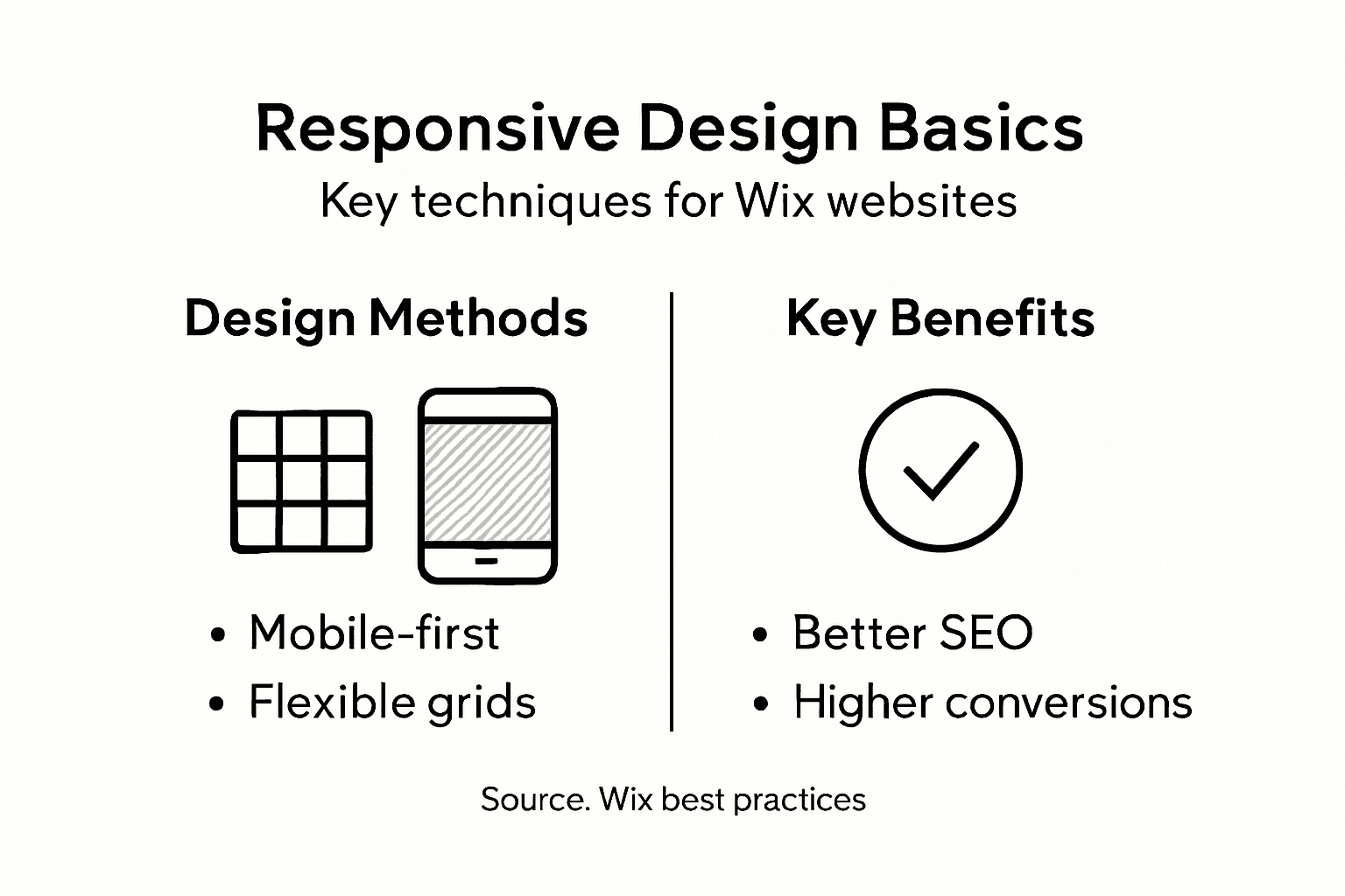
Mobile-First Approach is Essential | Starting design for mobile devices ensures optimal performance and user engagement across all platforms. |
Regular Testing is Critical | Test responsive designs on real devices to identify user experience issues early and ensure accessibility. |
Common Mistakes Can Undermine Performance | Avoid fixed-width elements and always account for mobile-friendly practices to maintain adaptability and engagement. |
Responsive design fundamentals and misconceptions
Responsive web design transcends simple screen size adjustment - it’s a sophisticated approach to creating digital experiences that seamlessly adapt across devices. While many believe responsive design is just about shrinking or expanding layouts, the reality is far more nuanced. Modern responsive design strategies encompass complex technical and user experience considerations.
At its core, responsive design involves several critical elements:
Fluid grid systems that proportionally resize content
Flexible image and media scaling
Dynamic typography that remains readable at different screen sizes
Touch-friendly interface elements
Performance optimization across bandwidth variations
A common misconception is that responsive design means creating identical experiences across all devices. Instead, it requires thoughtful adaptation. Device-specific interactions matter significantly. Touch interfaces demand larger tap targets, while desktop experiences can utilize hover states and precise mouse interactions.
Technical complexity plays a crucial role. Responsive design isn’t just visual - it involves intricate CSS media queries, JavaScript handling, and understanding diverse device capabilities. Responsive web design approaches must account for viewport variance, interaction types, and bandwidth limitations.
Pro tip: Always test your responsive design on multiple real devices to understand true user experience, not just browser-based simulators.
Core methods for creating responsive Wix websites
Creating a responsive website on Wix requires understanding several key technical approaches that ensure your site looks great across all devices. Responsive design best practices emphasize the importance of flexible layouts and adaptive design techniques that Wix users can leverage through the platform’s robust editing tools.
The fundamental methods for building responsive Wix websites include:
Utilizing Wix’s responsive breakpoint management system
Implementing flexible grid layouts
Creating scalable typography
Designing touch-friendly interface elements
Optimizing images and media for different screen sizes
Mobile-first design is crucial in modern web development. This approach means designing for mobile devices initially and then progressively enhancing the layout for larger screens. CSS layout techniques enable Wix users to create layouts that automatically adjust and reflow based on screen dimensions.
Wix provides powerful tools to manage responsive design, including drag-and-drop interfaces that allow precise control over element visibility, scaling, and positioning across different device types. Viewport meta tags play a critical role in ensuring proper rendering on mobile devices, helping developers create seamless experiences that adapt dynamically.
Pro tip: Always preview your Wix site on multiple device sizes during development to catch and resolve responsive design issues early in the process.
Here is a quick comparison of key responsive design techniques and their impact on Wix sites:
Technique | User Experience Benefit | Optimization Impact |
Fluid Grid Layouts | Content adjusts smoothly | Reduces layout issues |
Scalable Typography | Readable text at all sizes | Improves accessibility |
Responsive Images | Fast loading on all devices | Enhances performance |
Breakpoint Management | Layout adapts for each device | Minimizes scrolling |
Touch-Friendly Elements | Easier navigation on mobile | Increases engagement |
Feature breakdown: grids, images, and media queries
Responsive design relies on three critical technical components that work together to create adaptive web experiences. CSS media query techniques provide the foundation for creating flexible layouts that respond intelligently to different device characteristics, ensuring websites look great across various screen sizes.
The key technical features include:
Fluid grid systems with relative units
Responsive image scaling
Dynamic breakpoint management
Orientation-based layout adjustments
Viewport-sensitive styling rules
Flexible grid layouts form the structural backbone of responsive design. These systems use percentage-based or fractional units instead of fixed pixel measurements, allowing content to smoothly resize and reposition across different devices. Responsive design principles emphasize creating layouts that can dynamically adapt without losing visual integrity.

Media queries enable precise control over how content displays at different screen sizes. Typical breakpoints like 600px, 768px, and 992px correspond to mobile, tablet, and desktop experiences, allowing developers to create targeted styling rules that optimize layout and readability. Responsive images automatically scale within their containers, preventing layout distortions and maintaining visual quality across devices.
Pro tip: Always test your responsive design using actual device sizes, not just browser resizing tools, to ensure authentic user experiences.
The impact on SEO, conversion, and accessibility
Responsive web design strategies have become critical for online success, directly influencing a website’s search performance, user engagement, and overall digital accessibility. Modern businesses cannot afford to ignore the multifaceted impact of responsive design across key digital metrics.
The core impacts include:
Enhanced search engine rankings
Improved mobile user experience
Higher conversion rates
Reduced bounce rates
Broader audience accessibility
Cost-effective website maintenance
SEO performance receives a significant boost from responsive design. Google prioritizes mobile-friendly websites in search results, meaning sites that adapt seamlessly across devices will rank higher. This directly translates to increased organic traffic and better visibility in competitive digital landscapes.
Conversion optimization is another critical area where responsive design makes a substantial difference. Accessibility considerations ensure that websites remain usable for individuals with diverse abilities, expanding potential audience reach. By creating experiences that work smoothly across different devices and screen sizes, businesses can reduce friction in user interactions, ultimately driving more meaningful engagement and conversions.
Pro tip: Regularly audit your website’s mobile responsiveness using Google’s free tools to identify and quickly resolve potential user experience barriers.
See how core elements of responsive design support business goals:
Responsive Feature | Business Value | SEO/Conversion Impact |
Mobile Optimization | Reaches wider mobile audience | Higher search rankings |
Dynamic Layouts | Reduces maintenance effort | Fewer site errors |
Accessibility Tools | Expands market reach to all users | Improved user satisfaction |
Common mistakes and pitfalls with Wix responsive design
Responsive web design mistakes can dramatically undermine a website’s performance and user experience. Wix users often fall into subtle traps that compromise their site’s adaptability across different devices, leading to potential user frustration and reduced engagement.
Key responsive design pitfalls include:
Neglecting mobile-first design principles
Using fixed-width elements that break on small screens
Overlooking image optimization
Ignoring accessibility standards
Failing to test across multiple device types
Not implementing fluid typography
Fixed pixel usage represents one of the most common technical errors in Wix responsive design. Developers frequently rely on rigid pixel measurements instead of relative units, which prevents content from smoothly adapting across different screen sizes. Responsive design techniques emphasize the importance of flexible, proportional sizing to maintain visual integrity.
Accessibility and performance are often overlooked in responsive design. Many Wix sites fail to hide non-essential elements on smaller screens, create touch-friendly tap targets, or implement proper viewport meta tags. These oversights can significantly reduce user engagement and search engine rankings.
Pro tip: Use Wix’s built-in device preview tools to simulate and test your site’s responsiveness across multiple screen sizes before publishing.
Elevate Your Wix Website with Expert Responsive Design Solutions
Struggling with fixed pixel layouts or inconsistent mobile experiences on your Wix site? The challenge of delivering a seamless and accessible user experience across all devices can feel overwhelming. Many Wix users face pitfalls like neglecting mobile-first principles or failing to optimize images and touch interactions, which directly impact SEO rankings and conversion rates. At WebCityX we specialize in transforming Wix and Wix Studio websites into fully responsive digital experiences that captivate users and drive results.

Take control of your site’s adaptability now by partnering with a dedicated web design agency offering comprehensive website design SEO and technical support tailored specifically for Wix platforms. Don’t let common responsive design mistakes hold your business back. Discover how to enhance mobile optimization fluid layouts and dynamic typography with our professional services. Explore valuable insights and get started by visiting WebCityX today. Your perfect responsive Wix website is just a click away.
Frequently Asked Questions
What is responsive web design and why is it important for Wix sites?
Responsive web design is a technique that allows websites to adapt their layout and content based on the device used to access them. This is crucial for Wix sites as it enhances user experience, improves search engine rankings, and accommodates a wider audience on various devices.
How can I create a responsive website using Wix?
To create a responsive website on Wix, utilize the platform’s responsive breakpoint management system, implement flexible grid layouts, create scalable typography, ensure touch-friendly elements, and optimize images for different screen sizes.
What are common mistakes to avoid when designing a responsive Wix site?
Common mistakes include neglecting mobile-first design principles, using fixed-width elements that don’t adapt to smaller screens, overlooking image optimization, ignoring accessibility standards, and failing to test across multiple devices.
How does responsive design impact SEO and user engagement?
Responsive design positively impacts SEO by improving rankings in search results, as search engines favor mobile-friendly sites. It also enhances user engagement by providing an optimal browsing experience across various devices, leading to higher conversion rates and lower bounce rates.
Recommended

Comments