
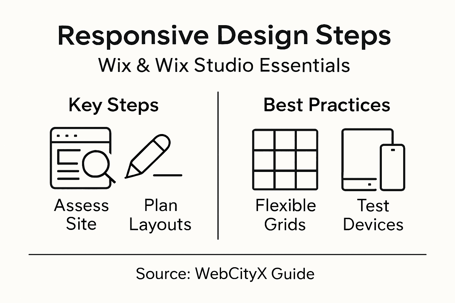
Responsive Design Steps for Wix and Wix Studio Sites
- Ekaterina WebcityX

- Jan 30
- 8 min read

Struggling with layouts that look perfect on desktop but fall apart on mobile? For web designers and developers in Hungary and worldwide, mastering responsive design for Wix and Wix Studio can make all the difference in keeping users engaged. Ensuring seamless adaptation across devices not only prevents broken elements and readability issues, but also supports search engine performance globally. This guide delivers step-by-step insights for creating consistent, user-friendly experiences that work on every screen.
Table of Contents
Quick Summary
Key Point | Explanation |
1. Assess Site Responsiveness | Evaluate your Wix site’s adaptability across devices to ensure seamless user experience and identify potential issues. |
2. Plan Breakpoints Effectively | Define specific viewport widths for layout adjustments to optimize the display on various devices, enhancing usability. |
3. Utilize Flexible Grids | Implement relative units and percentage-based measurements to create a responsive layout that adapts well to different screen sizes. |
4. Configure Responsive Settings | Adjust Wix design settings for mobile views and navigation to improve user engagement and create a unified experience. |
5. Regularly Test Responsiveness | Conduct comprehensive tests on multiple devices to identify design issues that may affect user experience before your site goes live. |
Step 1: Assess current site responsiveness
Assessing your Wix and Wix Studio site’s responsiveness is a critical first step in ensuring a seamless user experience across multiple devices. This process helps you identify potential design and functionality issues that could impact user engagement and search engine performance.
To thoroughly evaluate your site’s responsiveness, start by using multiple testing methods. Responsive design testing involves examining how your website adapts across different screen sizes and device types. Here are key strategies to assess your site:
Use browser developer tools to simulate various device screens
Test on actual mobile, tablet, and desktop devices
Check for consistent layout and readability
Verify image and content scaling
Ensure navigation menus function correctly
Pay special attention to common responsive design challenges like text legibility, image alignment, and touch-friendly navigation. Look for issues such as:
Below is a summary of common responsive design issues and their impact on user experience:
Issue | User Experience Impact | Search Engine Impact |
Horizontal scrolling | Difficult navigation on mobile | Lower usability ranking |
Overlapping elements | Confusing and unprofessional look | Reduced accessibility score |
Small/unreadable text | Poor readability for all users | Increased bounce rates |
Misaligned buttons | Hard to use on touch devices | Lower mobile conversion rates |
Horizontal scrolling requirements
Overlapping content
Unreadable text sizes
Misaligned buttons or interactive elements
Responsive design isn’t just about making things fit - it’s about creating an optimal viewing experience across all devices.
Conducting comprehensive responsiveness tests will help you identify areas for improvement and ensure your Wix site delivers a consistent, user-friendly experience worldwide.
Pro tip: Use free online responsive design testing tools to quickly identify potential layout and functionality issues before manual testing.
Step 2: Plan breakpoints and responsive layouts
Planning breakpoints and responsive layouts is crucial for creating a flexible, user-friendly website that adapts seamlessly across different devices and screen sizes. This strategic approach ensures your Wix site looks professional and functions perfectly from smartphones to desktop computers.
Responsive design planning requires defining specific viewport widths where your website’s layout will dynamically adjust. Consider these key strategies for effective breakpoint management:
Identify primary device screen sizes (mobile, tablet, desktop)
Use standard breakpoint ranges
Create flexible grid systems
Implement responsive CSS media queries
Test layouts at multiple screen widths
Typical breakpoint ranges for modern responsive design include:
Mobile: 320px - 480px
Tablet: 481px - 768px
Small Desktop: 769px - 1024px
Large Desktop: 1025px and above
Responsive design is about creating fluid experiences that adapt intuitively to each user’s device.
When planning your responsive layouts, focus on creating flexible content containers and proportional sizing that maintain readability and functionality across different screen dimensions.

Pro tip: Utilize Wix’s built-in responsive design tools and preview modes to quickly test and adjust your layout across multiple device types.
Step 3: Apply flexible grids and fluid images
Creating a responsive website requires mastering the art of flexible grids and fluid images that adapt seamlessly across different devices. This crucial step ensures your Wix site looks professional and functions perfectly on screens of all sizes.
Flexible grid techniques transform your website’s layout by using relative units instead of fixed pixels. Consider implementing these key strategies:
Use percentage-based width measurements
Implement CSS Grid or Flexbox layouts
Create proportional content containers
Utilize max-width properties for images
Design with mobile-first approach
To make images truly responsive, apply these essential CSS techniques:
Set max-width: 100% to scale images proportionally
Use height: auto to maintain aspect ratios
Implement responsive image attributes
Compress images for faster loading
Responsive design isn’t about making things smaller - it’s about creating intelligent layouts that adapt gracefully.
Focus on creating scalable visual experiences that look great on any device by using relative units and intelligent sizing strategies. Your goal is to maintain visual integrity across all screen dimensions.
Pro tip: Leverage Wix’s built-in responsive design tools to preview and automatically adjust your grid and image layouts in real-time.
Step 4: Configure Wix or Wix Studio settings
Configuring your Wix or Wix Studio responsive design settings is a critical step in ensuring your website looks perfect across all devices. This process involves fine-tuning various technical and visual parameters to create a seamless user experience.
Navigate to the Wix website builder settings and focus on these key responsive configuration areas:
Mobile view editor
Device-specific design adjustments
Responsive navigation settings
Performance optimization options
Content visibility controls
Follow these detailed configuration steps:
Open the Wix Editor platform
Select ‘Responsive’ design mode
Preview site on multiple device types
Adjust element positioning
Test and refine layout transitions
Responsive design is about creating flexible experiences that look great everywhere.
Pay special attention to mobile-specific design elements and touch-friendly interface components to ensure smooth interactions across different screen sizes. Your goal is to create a unified visual experience that adapts intuitively.
Here’s a quick reference for best practices in responsive design configuration:
Area | Best Practice | Business Benefit |
Mobile View Editor | Customize per device view | Improved mobile engagement |
Navigation | Simplify and optimize menus | Smoother browsing experience |
Performance | Optimize images/code | Faster site load, higher retention |
Content Visibility | Manage what displays per device | User sees relevant info on all screens |
Pro tip: Use Wix’s device preview modes to systematically test and optimize your responsive design settings before publishing.
Step 5: Test responsiveness across devices
Testing your website’s responsiveness is the final critical step in ensuring a seamless user experience across multiple devices and screen sizes. This comprehensive evaluation helps you identify and resolve any potential design or functional issues before your site goes live.
Responsive testing techniques require a systematic approach to verify your site’s performance on various platforms. Consider these essential testing methods:
Use browser developer tools
Test on real physical devices
Utilize online responsive design checkers
Simulate different screen resolutions
Check cross-browser compatibility
Follow these detailed testing steps:
Open browser developer tools
Resize browser window manually
Use device emulation modes
Test touch interactions
Verify content readability
Check navigation functionality
Thorough testing reveals the true adaptability of your responsive design.
Focus on comprehensive device coverage and interaction quality to ensure your Wix or Wix Studio site provides a consistent user experience across smartphones, tablets, and desktop computers.
Pro tip: Create a standardized testing checklist to systematically evaluate your site’s responsiveness and catch potential issues before final launch.
Step 6: Optimize for performance and usability
Optimizing your Wix or Wix Studio website for performance and usability is crucial in delivering an exceptional user experience across all devices. This final step ensures your responsive design not only looks great but functions smoothly and loads quickly.
Performance optimization techniques are essential for creating a fast and user-friendly website. Focus on these key strategies:
Compress and optimize images
Minimize code and scripts
Implement lazy loading
Use efficient CSS and JavaScript
Enable browser caching
Reduce server response times
Implement these specific performance improvements:
Choose lightweight theme designs
Use vector graphics where possible
Eliminate unnecessary plugins
Enable Wix performance settings
Optimize font and media loading
Performance isn’t just about speed - it’s about creating a smooth, intuitive user experience.
Pay special attention to mobile interaction design and touch-friendly navigation to ensure your site remains accessible and engaging across different devices and screen sizes.
Pro tip: Run regular performance audits using free online tools to continuously monitor and improve your website’s speed and usability.
Elevate Your Wix Site with Expert Responsive Design Support
Struggling with making your Wix or Wix Studio site truly responsive can be frustrating. The challenges discussed, like configuring flexible grids, planning breakpoints, and optimizing for mobile usability, require keen attention to detail and technical skill. If you find yourself overwhelmed by issues such as unreadable text, misaligned buttons, or slow performance you are not alone. These pain points directly impact user engagement and conversion rates.
At WebCityX, we specialize in delivering tailored web design, SEO, and technical support specifically for Wix platforms. Whether you need help assessing responsiveness or configuring device-specific settings our team is ready to create seamless and flexible layouts that look stunning on every device.

Don’t let your Wix site miss out on visitors due to poor responsive design. Discover how our expertise can transform your website into a fast, user-friendly experience that drives results. Visit our homepage now and take the first step towards a flawless responsive design with our professional website design services that ensure you stand out across all devices.
Frequently Asked Questions
How can I assess the responsiveness of my Wix site?
To assess the responsiveness of your Wix site, use multiple testing methods such as browser developer tools and actual device testing. Focus on verifying layout consistency, readability, and navigation functionality across various screen sizes.
What are the best practices for planning breakpoints in responsive design?
For effective breakpoint planning, identify primary device screen sizes and use standard breakpoint ranges such as mobile (320px - 480px) and tablet (481px - 768px). Create flexible grid systems and implement responsive CSS media queries to ensure your design adapts smoothly.
How do I create flexible grids and fluid images for my Wix site?
To create flexible grids and fluid images, use percentage-based width measurements and CSS techniques like Flexbox or CSS Grid. Set your images to a max-width of 100% to maintain proportions, ensuring they look great on any device size.
What settings should I configure in Wix for responsive design?
In Wix, configure settings like the mobile view editor, navigation design, and performance optimization options. Use the responsive design mode to preview and adjust element positioning for a unified visual experience across devices.
What methods can I use to test the responsiveness of my site?
Test your site’s responsiveness by using browser developer tools, testing on physical devices, and utilizing online responsive design checkers. Manually resize browser windows and verify touch interactions to ensure a consistent user experience.
What are the key strategies to optimize my Wix site for performance and usability?
Optimize your Wix site by compressing images, minimizing code, and implementing lazy loading techniques. Aim to reduce site load times by using efficient CSS and JavaScript, enabling browser caching, and regularly monitoring performance.
Recommended

Comments