
Website Navigation: Unlocking Better User Experience
- Ekaterina WebcityX

- Feb 24
- 13 min read
Updated: Mar 6

Lost visitors are lost opportunities. When customers from Budapest or anywhere in Hungary land on your Wix site, they expect to find answers quickly and easily. Clear, well-structured navigation does more than just move people between pages—it builds trust with customers and helps Google rank your business higher. This guide highlights key website navigation concepts that directly impact how visitors explore your site and how search engines understand your content.
Table of Contents
Key Takeaways
Point | Details |
Effective Navigation is Essential | Good navigation enhances user experience, keeps visitors engaged, and can directly impact conversion rates. |
Clear Structure Improves SEO | Well-organized navigation helps search engines index your site correctly, boosting your visibility in search results. |
Mobile Optimization is Crucial | A mobile-friendly navigation system is vital as the majority of web traffic comes from mobile devices. |
Regular Audits are Necessary | Conduct periodic checks of your navigation to identify and fix broken links and other usability issues. |
Defining Website Navigation and Core Concepts
Website navigation is how visitors move through your content. It’s the system that connects pages, guides users toward information, and shapes how they experience your site.
Think of it like walking through a physical space. Web navigation is the process of navigating information resources organized as hypertext or hypermedia on the World Wide Web—essentially providing a map so visitors don’t get lost in your digital space.
The Core Purpose
Navigation serves one critical job: helping people find what they need without frustration. When navigation fails, visitors leave. When it works, they stay longer, explore more pages, and complete actions like signing up or making a purchase.
For small businesses in Hungary using Wix, good navigation directly affects:
How long visitors stay on your site
Whether Google ranks your pages higher in search results
How many leads or sales you actually convert
Your overall credibility and professionalism
Good navigation isn’t a luxury—it’s the foundation of a site that works for your business.
Understanding Navigation Types
Navigation comes in multiple layers, and each serves a specific purpose:
Global navigation appears consistently across all pages (usually at the top). It lets visitors access main sections from anywhere.
Local navigation shows content within a specific section. If someone is browsing your “Services” section, local navigation might show individual service pages.
Supplemental navigation includes elements like breadcrumbs (showing where you are) or related links that provide alternate paths to content.
Contextual navigation consists of embedded links within your content itself—like linking from one blog post to a related article.
Why This Matters for Your Business
When a customer from Budapest visits your site, they expect to find information intuitively. If they can’t locate your contact form, pricing page, or portfolio within three clicks, they’ll bounce to a competitor.
Proper navigation also helps Google understand your site structure. Clear information structures guide users through different levels of content, which directly impacts your SEO performance and ranking potential.
Wix makes building navigation relatively straightforward, but many business owners overlook how crucial it is for both user experience and search rankings.
Pro tip: Map out your site structure on paper before building in Wix—list all pages you want, organize them logically, and identify which items belong in your main menu versus secondary menus.
Types of Website Navigation Menus Explained
Different navigation menus serve different purposes. Choosing the right one depends on how much content you have and how visitors browse on various devices.
Your navigation structure shapes how customers discover your services, products, and information. The wrong menu type can bury important pages, while the right one guides visitors exactly where they need to go.
Static Navigation Bars
Static navigation stays visible at the top of every page, always showing the same links. This works well for simpler websites with fewer main categories.
For a Hungarian small business with five to eight main sections, static navigation keeps everything accessible without extra clicks.
Advantages include simplicity and constant visibility. Visitors always know where the main menu is.
Dropdown and Mega Menus
Dropdown menus appear when visitors hover over or click a main menu item. They’re compact but reveal subcategories on demand.
Dropdown menus offer compact, hover-activated lists of subcategories suited for moderately complex sites where you need to organize many pages without cluttering the main navigation.
Mega menus display extensive content with categories, images, and multiple columns. They’re ideal when you have lots of products or services to showcase at once.
Mega menus work particularly well for e-commerce sites or agencies with broad service offerings. Wix supports both dropdown and mega menu functionality natively.
Mobile-Friendly Options
Hamburger menus (the three-line icon) collapse navigation into a button, essential for mobile visitors. This saves screen space on phones and tablets.
Breadcrumb trails show where visitors are in your site hierarchy. If someone is viewing a specific blog post, breadcrumbs display the path: Home > Blog > Post Title.
Mobile visitors make up roughly 60 percent of web traffic in 2024. Your navigation must work flawlessly on phones and tablets.
Sidebar and Footer Navigation
Vertical sidebar menus appear on the left or right of your page. These work well for content-heavy sites like blogs or knowledge bases.
Footer navigation provides secondary access to important pages at the bottom. Visitors often use footer navigation to find contact information, legal pages, or site maps.
Horizontal navigation bars typically sit at the top while footer navigation provides secondary access, creating a complete navigation ecosystem across your entire page.
Pairing navigation types creates redundancy. A visitor who misses something in the header might find it in the footer.
Here’s a quick comparison of website navigation menu types and their best use cases:
Menu Type | Ideal Website Size | Device Compatibility | Main Benefit |
Static Bar | Small (few pages) | Desktop & mobile | Simple, always visible |
Dropdown Menu | Medium (10–30 pages) | Mainly desktop, limited mobile | Expands categories, saves space |
Mega Menu | Large (over 30 pages) | Desktop only | Showcases broad offerings |
Hamburger Icon | Any size, mobile | Mobile & tablet | Space-saving, easy navigation |
Sidebar/Vertical | Content-heavy sites | Desktop, sometimes mobile | Organizes complex content |
Footer Links | Any website | Desktop & mobile | Backup access to key pages |
The best navigation combines multiple types strategically—primary menus for main sections, breadcrumbs for clarity, and footer links for secondary access.
Choosing Your Menu Strategy
Start by listing every page or section your business needs. If you have under ten main categories, static navigation works. If you have ten to thirty, add dropdown menus. Over thirty? Consider mega menus.
Always test your navigation on mobile devices. A beautiful desktop menu that doesn’t work on phones drives customers away immediately.
Pro tip: In Wix, test your menu on mobile view before publishing—use the device preview tool to see exactly how your navigation appears on phones and tablets.
How Navigation Impacts User Experience and SEO
Navigation does two jobs simultaneously: it helps visitors find what they need, and it helps Google understand your site structure. When navigation fails, both suffer.
A confusing menu drives customers away. Poor navigation also confuses search engine crawlers, making it harder for Google to index your pages and rank them higher.
The User Experience Connection
Visitors arrive at your site with a specific goal. They want to find pricing, read reviews, contact you, or learn about services. If your navigation makes this difficult, they leave.
Well-structured navigation reduces bounce rates—the percentage of people who leave without exploring further. It increases engagement by helping visitors discover related content naturally.
When someone finds what they need quickly, they stay longer on your site. Longer visits signal to search engines that your content is valuable.
How Search Engines Use Navigation
Navigation guides search engine crawlers through your site structure, clarifying relationships between pages and improving how Google indexes your content.
Google’s crawler doesn’t think like a human. It follows links. Your navigation provides the primary pathway for crawlers to discover all your pages.
If a page is buried deep in your site without clear internal links, Google might not find it. That page gets indexed slowly or not at all.
The Bounce Rate Factor
Bounce rate measures how many visitors leave your site without clicking anything. High bounce rates hurt SEO rankings because they signal poor user experience.
Confusing navigation increases bounce rate immediately. A visitor confused about where to go hits the back button within seconds.
Clear navigation with descriptive labels helps visitors find answers fast, reducing bounces and improving your SEO performance.
Internal Linking and SEO
Your navigation creates internal links. Every menu item links to another page on your site. Effective navigation enhances user experience by making content accessible via clear navigation pathways, which lowers bounce rates and increases dwell time—metrics search engines use to evaluate quality.
Multiple paths to important content also distribute link equity throughout your site, helping individual pages rank better.
Mobile Navigation and Rankings
Google prioritizes mobile experience heavily. If your navigation doesn’t work on phones, your rankings suffer.
Mobile-first indexing means Google crawls the mobile version of your site first. A broken hamburger menu or unclickable links tank your mobile experience score.
Navigation impacts:
How quickly visitors find information
How long they stay on your site
Whether they convert (sign up, call, buy)
How easily Google crawls your pages
Your overall search ranking potential
Poor navigation kills two goals at once: you lose visitors and lose search rankings. Good navigation wins on both fronts.
Real Numbers Matter
A Hungarian e-commerce business redesigned navigation to reduce main menu items from twelve to six and added breadcrumbs. Bounce rate dropped 23 percent. Pages indexed by Google increased from 87 to 156 in three months.
That’s not coincidence. Better navigation directly improved user experience and SEO performance simultaneously.
Pro tip: Use Google Search Console to find pages Google can’t crawl easily—they often lack clear navigation paths from other pages, so add internal links pointing to them.
Essential Features for Effective Navigation
The best navigation systems share common characteristics. They’re intuitive, consistent, and designed around how people actually search for information.
Building effective navigation means including specific elements that guide visitors and improve usability across all devices.
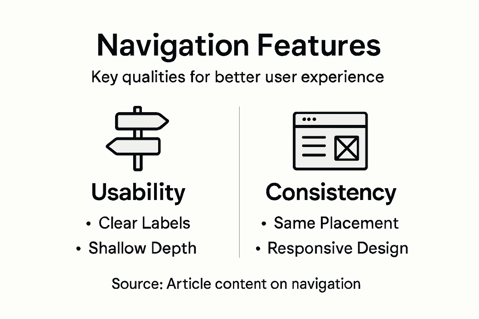
Clear and Descriptive Labels
Menu item names should tell visitors exactly what they’ll find. “Services” works better than “Solutions.” “Blog” works better than “Resources.”
Ambiguous labels confuse people. A visitor looking for pricing might skip a menu item labeled “Products” and assume pricing information isn’t available.
Test your labels by asking someone unfamiliar with your business what they expect to find under each menu item. If their answer surprises you, the labels need work.
Consistent Placement and Styling
Consistency builds user confidence. Your main menu should appear in the same location on every page using the same styling and font.
When navigation changes between pages, visitors feel disoriented. They waste mental energy relearning where things are instead of focusing on finding information.
Wix makes this easy because template-based navigation automatically applies consistently across all pages.
Shallow Navigation Depth
Keep your site structure shallow. Three clicks maximum to reach any page. Deeper structures bury important content and frustrate visitors.
If your menu requires four or five levels to reach a page, reorganize. Too much nesting makes navigation overwhelming.
Search Functionality
Incorporating search functionality assists users in quickly finding specific content without clicking through multiple menu layers.
Search works particularly well for content-heavy sites or businesses with large product catalogs. A visitor searching for “blue widgets” finds results instantly instead of hunting through categories.
Wix sites can add search functionality through built-in tools or apps.
Breadcrumbs and Footer Navigation
Breadcrumbs show visitors where they are in your site hierarchy. They appear as clickable text: Home > Services > Web Design.
Breadcrumbs provide quick navigation back to parent pages and clarify site structure. They’re especially valuable on mobile where menu space is limited.
Footer navigation repeats key links at the bottom of every page. Visitors scrolling to the bottom shouldn’t dead-end. They should find pathways to important pages like contact information or return policies.
Responsive and Mobile-Optimized
Key features for effective navigation include responsive design ensuring usability across devices, making your navigation work seamlessly on phones, tablets, and desktops.
Mobile visitors need larger touch targets and simplified menus. A hamburger menu with three main categories works better on phones than eight items crammed horizontally.
Essential navigation features:
This overview highlights essential navigation features and their user experience benefits:
Feature | What It Does | Business Impact |
Descriptive Labels | Clarifies page purpose | Reduces confusion |
Consistent Styling | Maintains same look everywhere | Builds trust |
Shallow Hierarchy | Limits click depth | Speeds up navigation |
Search Functionality | Allows fast content discovery | Supports large catalogs |
Sticky Menu | Keeps navigation visible while scrolling | Boosts conversions |
Breadcrumbs | Shows current page location | Improves site clarity |
Mobile Optimization | Adapts for touch screens | Increases mobile engagement |
Descriptive, specific menu labels
Consistent styling and placement across pages
Shallow hierarchy (maximum three clicks)
Built-in search functionality
Breadcrumbs showing location
Footer navigation with key links
Mobile-optimized design and interaction
Call-to-action buttons prominently displayed
Effective navigation combines multiple features working together—no single element does everything, but together they create an intuitive experience.
Call-to-Action Integration
Your most important conversion actions deserve prominent placement in navigation. A “Get a Quote” button or “Contact Us” link should be immediately accessible from every page.
Many businesses hide contact information in footer links, forcing visitors to scroll far. Put important actions where visitors naturally look first.
Pro tip: In Wix, create a sticky menu that stays visible as visitors scroll—this keeps your navigation and call-to-action buttons always within reach, boosting click-through rates significantly.
Common Mistakes and Practical Solutions for Wix
Many Wix site owners build navigation quickly and move on. Later, they discover visitors can’t find what they need or links lead nowhere.
These problems hurt both user experience and your bottom line. The good news? They’re fixable with straightforward audits and adjustments.
Broken Links and Dead Ends
Broken links frustrate visitors instantly. A visitor clicks “Services” expecting to see your offerings but lands on a 404 error page instead.
Broken links happen when you delete pages without updating menu items, rename pages without fixing links, or accidentally disconnect internal links during edits.
Conducting thorough audits to identify and fix broken links prevents these issues from damaging user experience and harming your SEO rankings.
Wix provides built-in tools to check for broken links. Use the SEO tool under “Settings” to identify pages with linking problems. Fix them immediately.
Overly Complex Menu Structures
Too many menu levels confuse visitors. A menu with six main items and each containing five submenus forces people to make dozens of decisions just to find information.
Simplify ruthlessly. Ask yourself: does every menu item deserve top-level visibility, or should some items combine under broader categories?
A Hungarian design agency reduced their menu from eight items to five by grouping related services. Visitors now found what they needed faster.
Inconsistent Navigation Design
Inconsistency erodes trust. When your menu looks different on different pages, visitors question whether they’re still on your site.
Maintain consistent font sizes, colors, spacing, and positioning across all pages. Wix templates handle this automatically if you use them properly without custom overrides.
Avoid manually editing navigation on individual pages. Use the global navigation settings to apply changes site-wide.
Mobile Navigation Failures
Many Wix sites work perfectly on desktop but fail on mobile. Hamburger menus don’t open, touch targets are too small, or submenus hide behind the main menu.
Test your mobile navigation thoroughly before publishing. Open your site on an actual phone, not just the desktop preview.
Common mobile navigation mistakes:
Hamburger menu icons too small to tap
Dropdown menus requiring hover (phones don’t hover)
Submenus appearing behind other content
Text too small to read on small screens
Tap targets requiring pixel-perfect accuracy
Every navigation mistake costs you visitors. A broken link that goes unfixed for a week might lose ten potential customers.
Missing or Vague Contact Information
Visitors should never hunt for contact details. Your “Contact Us” page must be one click from anywhere on your site.
Many Wix sites hide contact information in footer links or inside dropdown menus. Put it prominently in your main navigation.
Solution Checklist
Audit your navigation right now using this checklist:
Click every menu item and verify pages load without errors
Count your menu levels—simplify if you have more than three
Check mobile view on an actual phone device
Verify contact information appears in primary navigation
Confirm consistent styling across all pages
Test that all links work from multiple pages
Review page titles match menu item names
Wix provides templates where navigation consistency is built-in. When you update your website on Wix, avoid making navigation changes outside the main menu settings.
Pro tip: Set a calendar reminder to audit your navigation quarterly—broken links accumulate over time as you add, delete, and modify pages, and catching them early prevents visitor frustration.
Transform Your Website Navigation Into a Growth Engine
Struggling with confusing menus or buried pages that drive visitors away is a common challenge highlighted in the article. When navigation fails, user frustration rises, bounce rates increase, and your SEO suffers. Your visitors deserve intuitive, well-structured navigation that guides them effortlessly to your key services and contact points with clear labels and mobile-optimized design. At WebCityX, we specialize in crafting modern responsive website designs tailored for Wix and Wix Studio platforms that unlock your site’s full potential.

Discover how our expert team can simplify your navigation structure, integrate sticky menus, breadcrumbs, and effective call-to-action buttons that keep visitors engaged and improve your Google rankings. Don’t let poor navigation cost you customers and search visibility. Visit WebCityX now to explore how our modern responsive website design and hands-on SEO support can help your business thrive with better user experience and higher conversions. Get started today and watch your site become the clear, easy-to-use online destination your audience expects.
Frequently Asked Questions
What is website navigation?
Website navigation is the system that allows visitors to move through a website and find the information they need. It includes various menu types and structures that guide users through content, similar to a map in a physical space.
Why is good website navigation important for user experience?
Good website navigation helps visitors find the information they need quickly and intuitively. When navigation is clear, users stay longer on the site and are more likely to complete desired actions, such as making a purchase or signing up for a service.
How can website navigation affect SEO?
Effective navigation helps search engines understand the structure of your site, making it easier for crawlers to index your pages. Poor navigation can lead to higher bounce rates, which negatively impacts search rankings.
What are the different types of website navigation?
Common types of website navigation include static navigation bars, dropdown menus, mega menus, sidebar navigation, and footer links. Each type serves different purposes depending on the complexity of the website and the amount of content it has.
Recommended

Hey folks! I overheard two guys at the hardware store talking about where they buy bulk packaging, and one of them mentioned this site. I have been making small, personal-sized pizzas lately, and paper plates just do not cut it for keeping the crust crispy. I searched the site and found the https://www.mcdonaldpaper.com/p/safepro-cor10k-10x10x2-inch-kraft-plain-corrugated-pizza-boxes-50-cs.html and was thrilled that a 10x10 size exists! The plain kraft finish looks really rustic and cool, too. I ordered a case, and folding them is simple. They hold the heat well and keep the bottom crust perfectly crisp. I am very satisfied with these boxes!
Starting testosterone therapy was exciting, but I was nervous about how it would affect my hair. I wanted to keep the hair on my head while growing the beard I’d always dreamed of. A friend in a trans support group shared an article that made everything clear: https://ways2well.com/blog/testosterone-and-hair-growth-how-hormones-affect-hair. It explained that testosterone converts to DHT, which can speed up male‑pattern baldness if you’re genetically prone, while also encouraging facial and body hair growth. Knowing this, I’ve started a proactive scalp care routine and monitor my DHT levels with my doctor. I feel empowered, not scared, and I can finally appreciate each new beard hair without panicking about my hairline. This article gave me the roadmap I needed.